
Process Improvement Tools.
Standard Work.
Work Instructions.
Flow Chart templates.
Swim Lane Cross Functional Flowchart.
Value Stream Mapping.
Lean tools.
Time Study templates.
DMAIC tools.
Quality Improvement tools.
House of Quality QFD.
FMEA Risk Reduction.
Root Cause Analysis tools.
Problem Solving tools.
OEE.
Preventive Maintenance.
Skip to main content


Installation and Setup
Installation - Each User. Installation - Multi-user. Language Translations. Personalize Your Templates.Systems2win Training.
Quick Start Initial Training. New User Training. Training Matrix. Systems2win Leadership. Training Classes.Lean Training
Lean Training and Coaching. Lean Principles. Muda 8 Wastes. Goal - Lean Flow. Roadmap - Lean Journey. Value Stream Mapping. Standard Work. Hansei Lean Thinking. Lean Dictionary. Online Lean Training. Lean Leadership.Microsoft Office Training
Excel Training. Excel Drawings (without Visio). Excel Charts. Word Training. PDF Training. Document Storage and Naming.Support
Support.Value Stream Analysis
Excel templates and charts, with online training and videos
to Measure, Analyze, Improve, and Control your Value Stream
The biggest strength of your Systems2win Value Stream Mapping template is Value Stream Analysis
If your organization has not already provided a license, download your free trial now
Before you begin
Value Stream Analysis
The training on this page assumes that you have already:
- Organized your leadership for your lean transformation and trained your value stream team
- Followed the instructions for how to do value stream mapping to observe the 'As Is' state of your process
- Entered your units of measure and data into your value stream mapping template
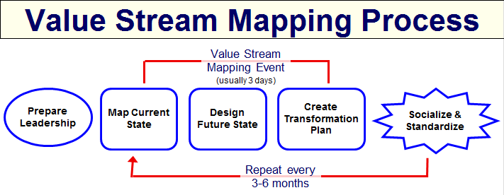
Road map for a typical
Lean Transformation
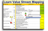
Value Stream Analysis Training
Contents
The Eye Catchers
The Layers
- Simultaneous Processes
- Critical Path
- Pre and Post-Production
- Drill-downs to and Roll-ups from Related Documents
Leadership
- Lean Journey - Status
- Lean Management Systems
Demand and Capacity
- Different units of measure for different processes
- Capacity must be greater than Demand
- Cycle Time must be lower than Takt Time
- Smallest Possible Staff
- Value Stream Capacity
Measures Within and Between Processes
- Lead Time — When can we have it?
- Distance
- Steps
- Cost
Critical Path — Deep Dive Analysis
- Productivity — considering ALL the factors that affect Capacity and Cycle Time
- % Complete and Accurate (Rework)
- Cumulative Scrap
- Guaranteed Turnaround Time
- Optimum Batch Size
- Path Codes and Scenarios
User-Defined Fields and Metrics
- Using all the power of familiar Excel — to make your value stream map yours
Search
Use CTRL+F
to find keywords
within this page
More VSM training
See the Section Menu
with links to more pages
with more training for
value stream mapping
Pop-up Help
In any Systems2win template,
click any row or column header for pop-up help
Value Stream Analysis
The Eye Catchers
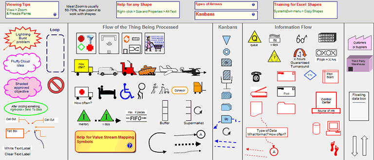
Value Stream Mapping Symbols
What catches most people's attention when they first view a value stream map are the value stream mapping symbols, which have been called "the language of Lean", and are so important that we have devoted an entire training page to them.
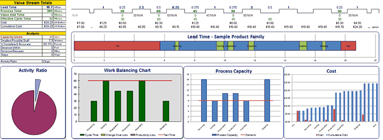
Charts
The next thing to catch attention are the Charts.
Your Systems2win Value Stream Mapping template comes with 5 pre-defined charts.
Lead Time Chart
Process Lead Time within your Critical Path processes are in green.
Queue time between your Critical Path processes are in blue.
If you elected to include your Pre or Post Production processes, they are on the ends — in red.
Tip: When you click the button to 'Add or Remove Columns', this chart gets automatically re-created.
(Try doing THAT with a home grown template)
Activity Ratio Pie Chart
Activity Ratio = Total Processing Time divided by Total Lead Time
(adjusted for Unit of Measure Conversions and Work Time Available)
This is an often embarrassingly small number that vividly shows how much room there is for improvement.
Tip: You can use the dropdown list to choose whether to chart Activity Ratio or % Value Add, which includes only Value Add activities, and is therefore an even more embarrassingly small ratio.
Work Balancing Chart
The Effective Cycle Time for each process on your Critical Path had better be lower than your Takt Time
or you won't meet your production schedule.
Tip: If a process has Change Over Time and/or Productivity Loss,
then this is a stacked bar chart — showing those components of total Effective Cycle Time.
Process Capacity Chart
The Capacity for each process on your Critical Path had better be higher than Demand or you will have some unsatisfied customers.
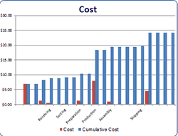
Cost Chart
Shows bars for both: Cost, and Cumulative Cost.
Supply Chain Charts
Special charts and metrics for Quality Screen, Delivery Screen, and Demand Amplification Screen.
Learn more about Supply Chain Mapping
Chart Tips
Hide them
You can hide the Charts section just like you can hide any other unused rows.
Move them
If you don't want to use a chart, just move it out of the Print Area.
Make your own
Notice that there are special features to make it easy for you to create your own charts, using everything you know about familiar Microsoft Excel.
The Time Sum Line
If you have ever before used any value stream map, then your eye should naturally drift down near the bottom of the map, (above the charts), where you will find the Value Stream Totals, also known as the Time Sum Line, or "the castle wall".

If a value stream map has only 3 "bottom line" calculations, they should be these 3:
- Lead Time
- Process Time
- Cycle Time
You will find training for these foundational lean metrics in our Lean Glossary.
And notice that you can also easily hide or unhide additional rows of 'bottom line' metrics for Cost, Steps, and more...
all without programming. You simply unhide the rows that you need.
Andons
Most people don't notice the Andons until they are analyzing their own real-world value stream map
when they notice, "Hmm... why is that number bold red???"
"Wait a second... that process capacity won't meet demand. Or that Cycle time won't meet takt time.
Or we're utilizing our people more hours than we plan to schedule them to work."
"Wow... that was helpful. In fact, those are some of the very most important factors of value stream analysis, and it sure it nice that my Systems2win template makes it difficult to embarrass myself by missing such an important oversight..."
Tip: In the small white cells just to the left of Process Capacity and Utilization, you can enter your own user-defined thresholds for how close to the edge you want to get before your value stream mapping andons turn bold red to alert you to problems.
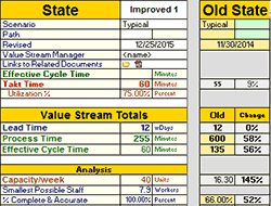
Side-by-Side Comparisons
Import Old State Comparison Data
When you scroll to the right, there's one more button that you can click to Import Old State Comparison Data for eye-catching side-by-side comparisons to answer the question:
"How much better is our proposed Future State vs. the way we've been doing things?"
Value Stream Analysis
The Layers
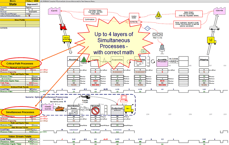
Simultaneous Processes
When you click the button to 'Hide or Show Rows', you will notice that you can have up to 4 tiers (or layers) of Simultaneous Processes.
In other words...
if you have multiple streams of activities that happen at the same time and then later merge together to feed a downstream operation...
then you will REALLY appreciate the advanced features of your Systems2win value stream mapping template to correctly handle the advanced math required to properly analyze simultaneous processes.
Video: Hide or Show Rows
Value Stream Map
Critical Path Processes
If your value stream has multiple streams of simultaneous processes, then you will soon come to appreciate the Systems2win innovation to
always keep all critical path processes in the Critical Path tier
The benefits of this convention are enormous
- Your critical path is extremely obvious
- Math is a whole lot easier to follow and validate
- Math mistakes due to a confusing critical path flow are greatly reduced
- Math for dead ends in Simultaneous Processes are handled correctly
Lead Time already only considers Critical Path.
Process Time, VA, and Steps should always consider dead ends.
Cycle Time for dead end processes can be easily excluded by simply overriding.
The compromise of this convention
In some rare circumstances, the longest cycle time or lead time might be first in one sub-stream and then another.
The proper way to handle this is to always display the critical path process in the Critical Path tier, even if that means that you need to show the physical flow using:
- arrows between layers
- sub-captions just below the Process Boxes - to indicate physical location where the process is performed
Tip: Andons will turn italic red in the bottom Time Sum Line if Lead Time for any Simultaneous Process has larger values than the Critical Path process.
Simply fix the mistake,
by ensuring that the Critical Path tier
contains all critical path processes.
Pre and Post-Production Processes
See our online training for several optional ways to handle segments of your value stream map.
One powerful option is use your 'Hide/Show Rows' button to unhide the optional tiers of processes for Pre and Post Production.
Drill-downs and Roll-ups
The final 'layer' of a value stream map exists 'off the map'.
One of the most powerful features of your Systems2win templates is the ability to easily link to (and roll up data from) related documents.
For example, you might drill down to and roll up data from a Swim Lane Functional Flowchart that has far more detail than would be appropriate for a value stream map.
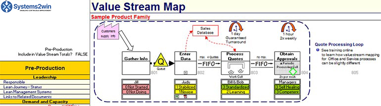
Value Stream
Leadership
On your Sample sheet, if you click the 'Hide/Show Rows' button to Show All Rows,
you will see the following sample data.
You can optionally hide the Leadership section,but if your goal is to Measure, Analyze, Improve, and Control your value stream (not just draw it) then you will probably find this section very useful.
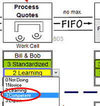
Use the dropdown lists for each process to select your answers to the questions:
"How far along is this team on their Lean Journey?"
"How far along is this leadership team with using effective Lean Management Systems?"
Like every Systems2win dropdown list on any Systems2win template...
you can easily personalize your own dropdown lists
(in ways that your personalizations will be automatically found and transferred every time you upgrade)
The conditional formatting will turn the correct color even if your change the words for your own user-defined codes as long as your dropdown choices start with:
0 for Red
1 or 2 for Yellow
3 for Green
Value Stream Analysis
Demand and Capacity
Different units of measure for different processes
It's impossible to have a conversation about Demand and Capacity without first answering the question:
"for what?"
Demand for what? Capacity for what?
What is it that you are delivering to your customer?
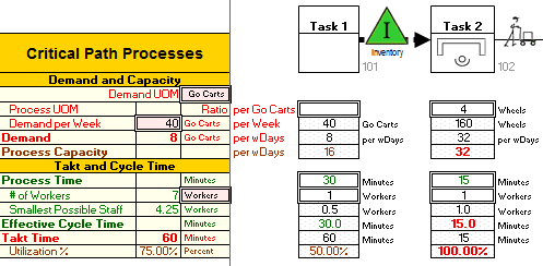
In the pink double-border cells, (see image), you specify:
- Demand Unit of Measure
This is the unit of measure for "the thing being transformed"
which might be medical patients, loan requests...
In this example, we are making "Go Carts"
- Demand per Week
Even if your forecasts use some other time period, you enter Demand per Week but then notice that if you use your button to 'Change Lead Time Unit of Measure', then the next row calculates Demand per your currently-selected Lead Time Unit of Measure, allowing you to switch at any time between working days, calendar days, weeks, or hours
Between the rows for Demand UOM and Demand per Week, notice the row for 'Process Unit of Measure'
If a Process within your value stream uses a different unit of measure, then in the column for that process, you can optionally enter the Ratio, and (in the cell to the right) enter the Unit of Measure.
For example Task 2 is making 4 Wheels per Go Cart.
Notice that all the math for that entire Process is now in "Wheels", rather than "Go Carts"
which is a really good thing, because you can be sure that the person working on that process is not thinking in terms of "How many Go Carts worth of Wheels do I need to make today?"
She is thinking "How many Wheels do I need to make today?"
And now your value stream map is understandable to her.
If every process in your value stream uses the same primary Demand UOM,
(for example, every process in your hospital value stream is transforming the "patient")
then you can simply hide that row
Video: Units of Measure
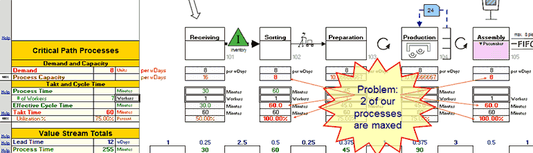
Andons
In Task 2, notice that some data is bold red — to alert you that there is a problem with your plan.
If Capacity is less than Demand, you have a problem.
If Cycle Time is greater than Takt Time, you have a problem.
If Utilization of your people greater than Work Time Available, you have a problem.
If you see bold red Andons, then you need to Stabilize your process so that it is capable of meeting your customer demand.
Value Stream Capacity
In the Value Stream Totals section
(near the bottom of your value stream map)
you will find calculations with special features that will delight you as you discover them at your own learning pace.
Value Stream Totals for:
- Smallest Possible Staff
- Total Capacity of your entire Value Stream
taking into consideration what if scenarios — like "what if this bottleneck process works overtime?"
- and more Key Performance Indicators that might be important to YOUR value stream
(or perhaps another value stream coming soon to your future)
Value Stream Analysis
Within and Between Processes
Lead Time — When can we have it?
The Lead Time Chart
makes it very easy to see that Lead Time consists of:
the sum of Process Lead Times (time within a process)
+ the sum of Queue Times (time between processes)
and you can optionally choose whether to include or exclude Pre and Post-production processes from your lead time analysis. Learn more
The Lead Time Unit of Measure Converter
allows you to click the 'Change Lead Time UOM' button at any time to switch between:
- Working Days
(excluding weekends and other non-working days) - Calendar Days (to more accurately answer your customer's question: "When can I have it?")
- Weeks
- Hours
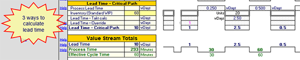
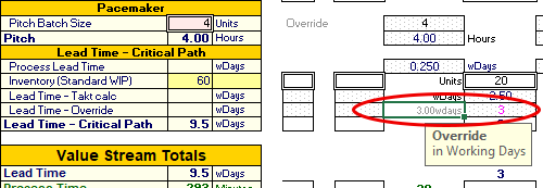
Three ways to calculate lead time
In your Systems2win Value Stream Mapping template v15.1 R180214 or higher, there are 3 ways to calculate lead time.
- You can enter an override value in the Lead Time Override field.
In the cell just to the LEFT of the 'Between Processes' column,
(in other words, it the same column below the primary process...)
enter your override value in 'Working Days'
(and notice how your template automatically converts Working Days into your currently-selected Lead Time Unit of Measure, which might be Calendar Days, Weeks, or Hours, which you can change at any time, by using the Change Lead Time UOM button in the Systems2win menu.
- Lead Time - Takt Calc
In the column just to the RIGHT of the process, enter the amount of Standard WIP Inventory that is usually found both WITHIN that process, and immediately AFTER it
Lead Time Takt Calc = Std WIP * Takt Time
In other words, how long does this stuff usually stay there at the rate that the customer buys it?
- Process Lead Time
If you don't enter data for either Override or Inventory WIP, then Lead Time will equal Process Lead Time.
In other words, how long does it take to make a batch of this stuff, and then immediately pass it to the next operation? (assuming zero queue time between processes)
Process Lead Time
Time WITHIN each process
Unless you override it, Process Lead Time is calculated as
Cycle Time * Pitch Pulse Batch Size
Why would you override Process Lead Time?
If 'the thing' continues to be transformed in a way that does not involve the operator...
(perhaps drying, curing, growing, fermenting...)
then you can override Process Lead Time
Queue Time
Time BETWEEN processes
Queue Time
If you are using an older template that has rows for Queue Time, then the math is a little different.
Your template will calculate Lead Time as the sum of all Queue Times + all Process Lead Times.
It will always include Process Lead Time as a a separate value from Queue time, so you need to enter the amount of Queue Time BETWEEN processes.
Get a free upgrade
If your Annual Maintenance is current, and you like the new way better...
(to enter 1 combined value for the Lead Time, considering both the Process Lead Time and the time that it waits AFTER each process...)
then you can request us to send you the latest new templates at any time.
Distance
Distance Within a process is usually measured in feet or meters.
Distance Between a process is usually measured in miles or kilometers.
All default units of measure are defined in the pink cells in the headers for the Critical Path.
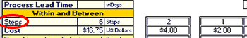
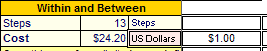
Steps
A "step" happens anytime that the thing being transformed could be handed off, in either:
1) sub-steps WITHIN each process
2) transportation or delays BETWEEN each process
Perhaps the most common mistake of value stream mapping
is not understanding the definition of a Continuous Flow Process Box
and how there might be dozens of sub-steps that should be depicted in a related flowchart
(and NOT split into separate Process Boxes on the value stream map)
The 'Steps' field on your value stream map gives a much more succinct insight into possible process complexity — and (if important) people can click link icons to drill down to related documents that explode the details of the underlying complexity.
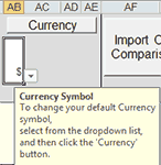
Cost
Currency button
Your Systems2win value stream mapping template has a special button that makes it exceptionally easy to instantly convert every currency cell in your value stream map to a new currency.
Simply use the dropdown list to select your desired currency symbol, and then click the 'Currency' button.
Because many currencies use the same symbol, you can also clarify exactly which currency you are using, by entering your currency description in the pink field in the headers for the Critical Path.
Cost Chart
The pre-formatted Cost Chart depicts both Cost and Accumulated Cost.
(and notice that unlike your home-grown template, this chart still works even if you hide the rows containing the source data — when you want to minimize clutter in the finished value stream map that you publish for distribution)
Value Stream Analysis
Critical Path Deep Dive
One huge benefit of the Systems2win convention of keeping all Critical Path processes in the same tier
is that this makes it far easier for you to use everything you know about familiar Microsoft Excel
to write your own user-defined formulas for ANY Key Performance Indicators that are critical to the success of YOUR value stream
AND... it makes it far easier for you to use your pocket calculator to validate and trust the (extensive) calculations that we have already programmed for you.
Critical Path Analysis calculations that you might never be able to program for yourself, such as...
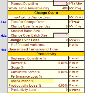
Productivity
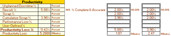
Productivity Loss % = the compounded losses of Downtime, Rework, Cumulative Scrap, Performance Loss, and User-Defined %
Productivity Loss is identical to Overall Equipment Effectiveness OEE Loss. We simply renamed it for office, service & medical industries that can't relate to "equipment" as a factor affecting productivity.
There are are large number of extremely useful calculations happening beneath the curtain.
To validate and trust the numbers, we suggest to start by entering some simple round numbers that you can easily cross reference using your pocket calculator.
Once you have studied and validated the calculations enough to trust your new Power Tool, you will soon wonder how you ever considered attempting to do this type of value stream analysis with just a pencil and a pocket calculator.
Download your free trial now, and put it through your paces.
Advanced Tips for Productivity
If you just want to plug an override number for Productivity Loss % simply enter your guesstimate number into the row for 'User-Defined %', and leave all the other Productivity factors blank.
If you override Process Capacity then it calculates Overall Productivity Loss as Good units produced / (Work Time Available / Cycle Time)
Staff unavailability is simply a form of Unplanned Downtime %
Don't just read this with glazed eyes...
Download your free trial, and learn how to use these features to increase YOUR productivity
% Complete and Accurate (Rework)
Percent Complete and Accurate is the flip side of Rework.
In other words, if a process has 3% Rework, it has 97% Complete and Accurate.
Lean Manufacturing tends to prefer to use Rework;
Lean Office and Service tend to prefer % Complete and Accurate.
Your Systems2win template provides both calculations.
Cumulative Scrap
Scrap doesn't just affect one process.
Every upstream process needs to produce enough to keep feeding the downstream process enough to meet ultimate customer demand.
Your Systems2win value stream mapping template calculates the effects of Cumulative Scrap correctly.
Guaranteed Turnaround Time
What is the longest time that your customer will ever wait for any product variation within the product family produced by your value stream?
In other words...
what is the rock-solid answer to your customers' most common question:
"When can I have it?"
Use the special features in your Sytems2win Value Stream Mapping template to calculate Guaranteed Turnaround Time
Optimum Batch Size
If Change Overs are an important consideration affecting the flow of your value stream, then the change over optimization calculations in your Systems2win Value Stream Map can easily justify a very fast Return on your entire Investment.
Path Codes and Scenarios
You should NEVER show multiple scenarios on an "As Is" value stream map, but it is rather common to show multiple scenarios on a single "Future State" map.
See our online training to choose between multiple ways to depict multiple scenarios on a single map with Path Codes and Scenarios as the most powerful and popular option.
Value Stream Analysis
Anything Else
User-Defined Fields and Metrics
Remember, your Systems2win Value Stream Mapping template is an Excel template.
It isn't "like" Excel. It "is" Excel.
It doesn't force you to learn some confusing interface to import and export data to and from Excel.
You can use absolutely everything you know about familiar Microsoft Excel to add unlimited rows of user-defined fields and unlimited user-defined lean metrics and unlimited user-defined charts and (if you're that into it...) even user-defined Visual Basic macros
You're not wasting your time learning yet another new software program...
You are becoming a more and more expert user of the single most popular software in the world of business...
Microsoft Excel
And (of course) your Systems2win value stream mapping template has special features to make it even easier to leverage your Excel skills beyond what you might have thought was possible.
Learn more about user fields
Return to home training page for how to do value stream mapping
When to use this tool
in a Typical Lean Journey for Lean Transformation
- Phase 0)
Firefighting - Phase 1) Prepare Your Leadership
- Phase 2) Design Value Streams to Flow
- Phase 3) Analyze, Stabilize, Visualize, and Standardize each process
- Phase 4) Continuously Improve
Road map for a typical
Lean Transformation

The right tools to
Define, Measure, Analyze, Improve, and Control
your value stream maps
(not just draw them)
Own Yours Now
If your organization has
not yet provided a license,
own yours now
Training and Coaching
Consider Training and Coaching to support your teams to succeed
Training to get you started.
Tools you won't outgrow.
Schedule a Conference
Schedule a conference
to discuss your challenges
with an experienced lean advisor